Wallpapers
Okay, on Monday, I made a Dan/Casey wallpaper for ![[livejournal.com profile]](https://www.dreamwidth.org/img/external/lj-userinfo.gif) celli. It turned out too dark (I've since learned that pictures look brighter/higher contrast when I'm working on them in PhotoshopCS, so I need to factor that in). I've played with a few different effects on the texture layers and came up with four different lighter versions.
celli. It turned out too dark (I've since learned that pictures look brighter/higher contrast when I'm working on them in PhotoshopCS, so I need to factor that in). I've played with a few different effects on the texture layers and came up with four different lighter versions.
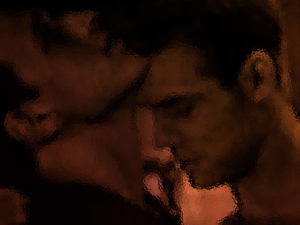
The original:

Version 1:

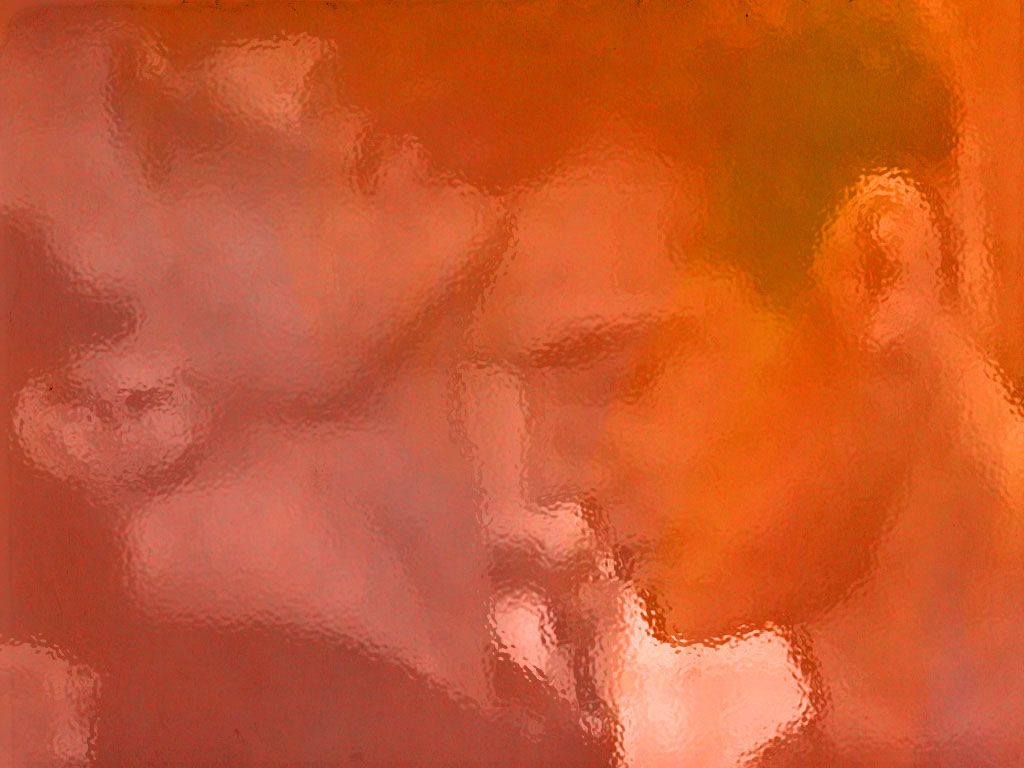
Version 2:

Version 3:

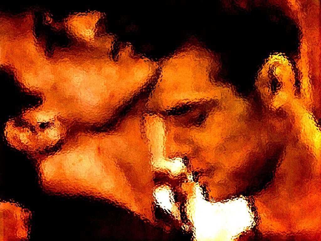
Version 4:

So, which do you prefer as a wallpaper? Which do you prefer just as a graphic? Is there a difference between the two, and if so, what do you look for in a wallpaper vs. a manip?
The original:
Version 1:

Version 2:
Version 3:

Version 4:
So, which do you prefer as a wallpaper? Which do you prefer just as a graphic? Is there a difference between the two, and if so, what do you look for in a wallpaper vs. a manip?
no subject
no subject
no subject
Personally, 2 is the one I'd use. I like the colours, and it's not-detailed enough that it wouldn't bother me.
4 is hot, and I like it as a graphic, but it would drive me completely nuts on my desktop. That's far too much energy/colour/contrast for me to blur out when I'm trying to do something other than stare and drool.
no subject
They're all okay, mind you, and that's a lovely manip, but that's how I decided which I liked best.
Thanks. I'm trying to get an idea of how other people's tastes differ from mine, I guess.
no subject
no subject
no subject
I also think 1 and 4 are my favorites, and probably 1 is edging 4 out.
no subject
Heeeee! Okay, that cheers me up considerably.
I also think 1 and 4 are my favorites, and probably 1 is edging 4 out.
I find that I like 4, but for a semi-permanent, in-my-visual-background, it's too bold/bright. Huh. Interesting that we both settled on 1, in the end.
no subject
no subject
no subject
no subject
no subject
Heh. It could be the first all-fen wedding party!
no subject
no subject
Thank you. And that's also why I had to use the "glass"/weird blurring effect. I couldn't get the edges to work together (I have no idea how
no subject
Me, too. I like the fact that the colours are soothing on my eyes, but it also feels... possible, you know? It made me feel oddly voyueristic while making it, like I should be leaving Dan and Casey alone to finish what they're doing.
And yet, I don't feel voyueristic when I write smut with them. That's kind of strange. *g*
no subject
But she didn't have Anya's bridesmaids' dresses.
no subject
(Very pretty though.)
no subject
Oh, that's a rather delightful tale. I'm perfectly happy not to be the first.
But she didn't have Anya's bridesmaids' dresses.
Hee. True. Do you actually have an Anya's bridesmaid dress, or are you just willing to wear
that monstrousityone?Meanwhile, I've decided I'll and in the essay on Friday (and screw 'em if they take marks off. It'll be a maximum of 10% per day, which means that since this in only worth 15%, I'll have lost like 3 marks in the overall thingy. I doubt that'll make the pass/fail difference.), I'm going to play with Danny-with-a-gun now.
And then i'll pout a little since I posted a wip and no one commented. I'm indulging my inner attention-grabbing three year old.
no subject
As long as you do get the essay done!
Is that 'Therapy'? I'm saving it for after I have my bath as an incentive to stop playing pooter games (all the pooter Mah Jonggs are too confusing for me - the screens are so small, all the tiles look the same), get off my lazy bum and get on with something, as it's nearly lunchtime!
no subject
I keep stuffing around, but when i did sit down this afternoon, I got quite a bit done. In fact, I'll force myself to read through and highlight the remaining 7 pages of articles I have to read. Then, it's just shoving it together, referencing the right bits and handing it in inside a pretty cover.
Is that 'Therapy'? I'm saving it for after I have my bath as an incentive to stop playing pooter games (all the pooter Mah Jonggs are too confusing for me - the screens are so small, all the tiles look the same), get off my lazy bum and get on with something, as it's nearly lunchtime!
Yeah, I'm all... I'm kinda happy with it, because
instead of studyingI wrote some more today. And, suddenly, I have a scene where Dan and his dad *talk* (which I also "workshopped" at creative writing today and they *loved* it, so yay!) and where Casey shows some relationship angst. I mean, I'm not absolutely positive of the order they'll appear in during the next session, and I'm still not quite sure of how it's going to be a happy Casey/Dan ending, but it's coming together! There's actually plot! Themes, even!Yeah, I'm still ridiculous happy that everyone loved it.
no subject
no subject