Wallpapers
Okay, on Monday, I made a Dan/Casey wallpaper for ![[livejournal.com profile]](https://www.dreamwidth.org/img/external/lj-userinfo.gif) celli. It turned out too dark (I've since learned that pictures look brighter/higher contrast when I'm working on them in PhotoshopCS, so I need to factor that in). I've played with a few different effects on the texture layers and came up with four different lighter versions.
celli. It turned out too dark (I've since learned that pictures look brighter/higher contrast when I'm working on them in PhotoshopCS, so I need to factor that in). I've played with a few different effects on the texture layers and came up with four different lighter versions.
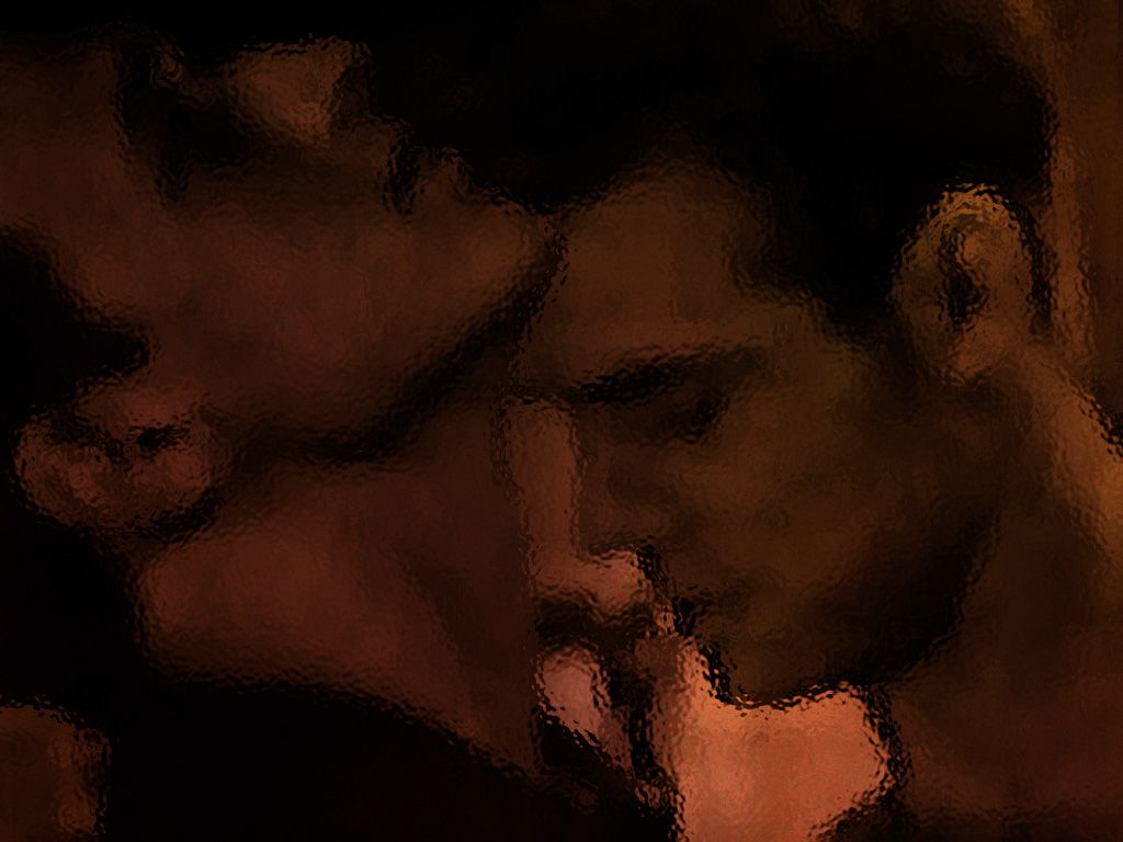
The original:

Version 1:

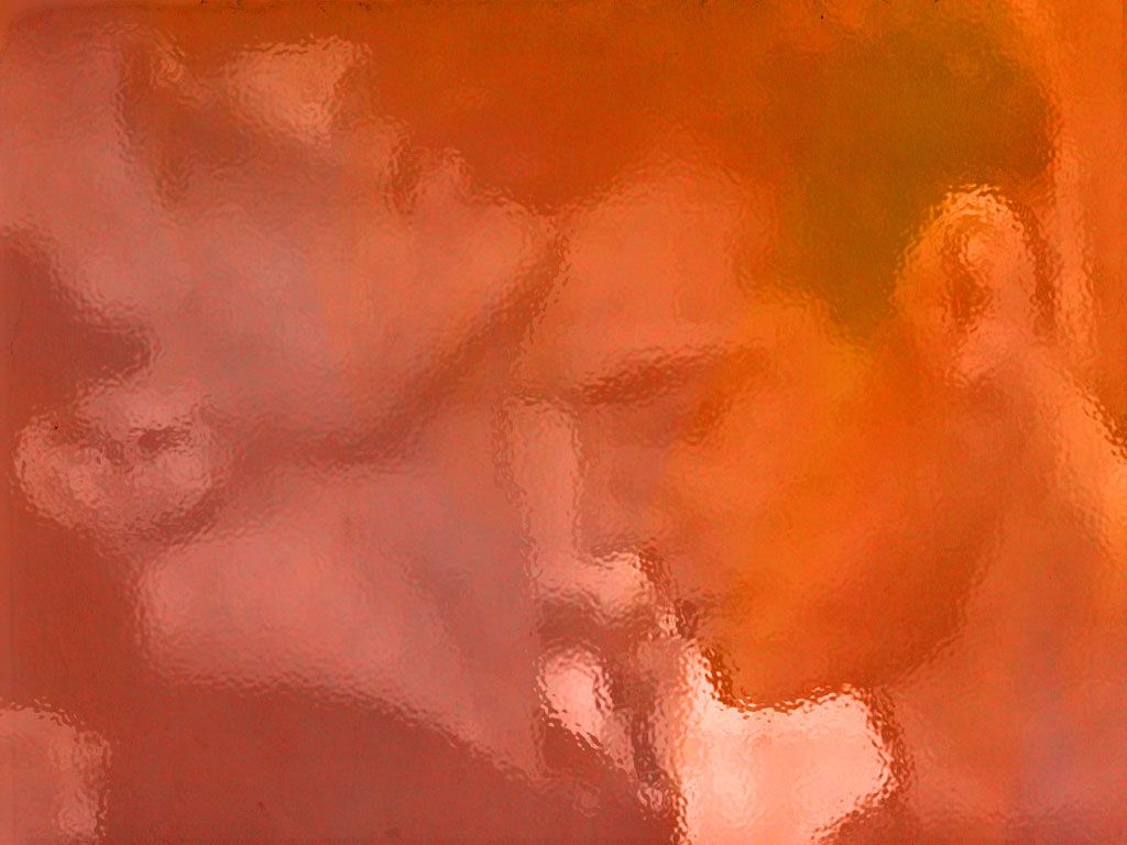
Version 2:

Version 3:

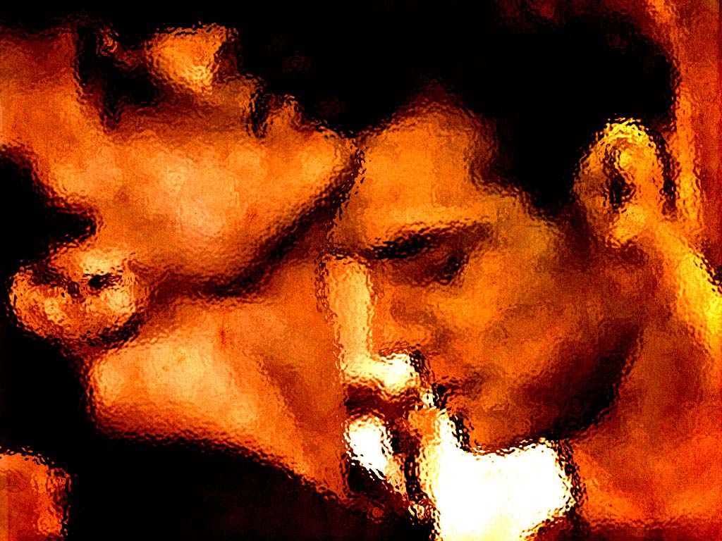
Version 4:

So, which do you prefer as a wallpaper? Which do you prefer just as a graphic? Is there a difference between the two, and if so, what do you look for in a wallpaper vs. a manip?
The original:
Version 1:

Version 2:
Version 3:

Version 4:
So, which do you prefer as a wallpaper? Which do you prefer just as a graphic? Is there a difference between the two, and if so, what do you look for in a wallpaper vs. a manip?
no subject